Colour theory underpins all creative understanding. Having been evolved and enriched by the contributions of notable scholars and pioneering publications, few works have been as influential in the art world as Emily Vanderpoel’s Color Problems.
First published in 1902, this staggering work took the understanding of colour theory at the turn of the century and reimagined it across the worlds of art, science, and design. Developing the theories established by Newton, Goethe, and their later compeers, Chevruel and Rood, Vanderpoel’s unique volume presented colour in a way that appealed across the disciplines, breaking down key theories in a series of experimental and visually stunning illustrations.
While it was underappreciated in its time, Vanderpoel’s expressions of colour anticipated major developments in modern art by nearly half a century, inspiring the likes of Klee, Albers, and Rothko.
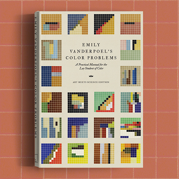
Emily Vanderpoel's Color Problems
Vanderpoel’s groundbreaking methodology of colour analysis was built from the theorists before her, with Color Problems being one of the first books on colour theory produced and published by a woman. Under the guise of feminine ideals, Vanderpoel (1842–1939) looked extensively at existing colour theories to create new rhetoric that applied practical methodologies for hobbyists and everyday readers.
A modist watercolourist, she adapted stiff scientific theories into nuanced and emotive language, producing a volume that appealed to female creatives with multiple interests. Intended for artists, as well as decorators, designers, lithographers, florists, dressmakers, and milliners (all occupations deemed appropriate for women at the time), Color Problems acts as a volume to expand one’s own understanding of colour, cemented in succinct scientific theory and aided by rich visual explanations.
‘Does the possessor of a naturally fine voice think he can dispense with the time and trouble of cultivating it? The same reasoning may well be applied to color and its study.’
Emily Noyes Vanderpoel, Colour Problems
Colour Theory
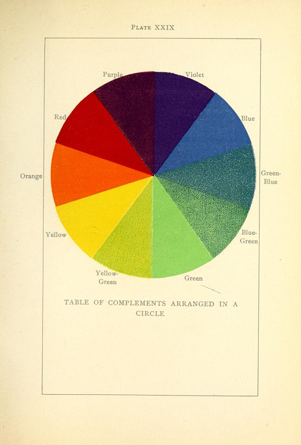
In the first half of the work, Vanderpoel summarises explanations of the key theories laid out by Isaac Newton (1642–1726/27) and Johann Wolfgang von Goethe (1749–1832), looking at the science of light and colour perception. She then explores the more modern ideas from Michel Eugène Chevreul (1786–1889) and Odgen Rood (1831–1902) and their classification of harmonious and contrasting colours. Looking at how to practically apply these theories for further understanding, she proves their ideologies in a series of charming colour experiments.
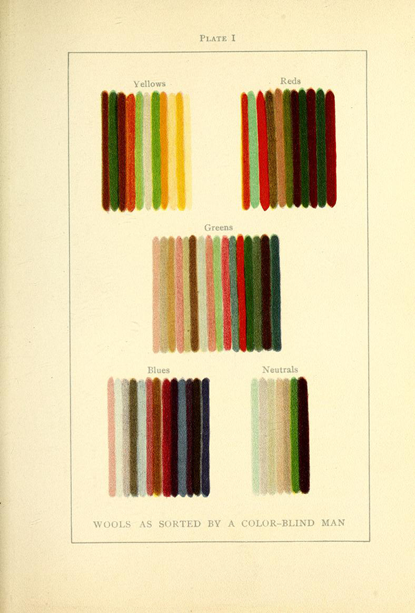
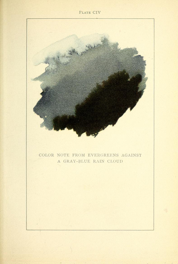
One such composition (pictured above) intended to explain the theories around colour blindness presents the threads of different coloured wools sorted and laid out in delicate stripes by a colour-blind man. Another of Vanderpoel’s experiments notes the colours and hues found in nature, such as the palette of woodland evergreens standing against a ‘gray-blue rain cloud’. These explorations of colour are free-flowing, her artistic inclination as a watercolourist particularly evident.
Colour Theory and Abstract Expressionism
To further understand Vanderpoel’s influence in the art world, we must focus on her collection of coloured grids: a series of geometric expressions that break down the colour palettes of everyday, antique, and natural objects. Egyptian mummy cases, Assyrian tiles, early Greek vases, butterfly wings, and leaves are all under inspection; their palettes are scrutinised in 10×10 grids of coloured squares. Laid out in an almost Tetris-like manner, each shade appears next to its neighbour to explore their relationship with one another and a conjunctive whole—a method of colour analysis revolutionary for its time.
The spectrum of colours had been visualised predominantly in books of swatches and illustrations of colour wheels, but none applied the theories to reality first-hand. Vanderpoel aimed to create a harmonious aesthetic in the everyday, producing abstract expressions of commonplace items and day-to-day colour rooted in scientific theory, with her vibrant grids breaking down the colours of an object to evaluate the dominant theories in practice. In her efforts to understand the effect of colour on the eye, imagination, and emotion, she produced geometrically elegant works of art, quietly pre-empting the Abstract Expressionist movement by over fifty years.
While her illustrative methods were pioneering, when Vanderpoel’s Color Problems was published, her method of breaking down colour to its purest composition was not revolutionary regarding colour theory or art history. Established in the works of Newton and later developed by Goethe and Rood, the analytic style of isolating colours to note their relationship and influence on the viewer was a key practice. It was fundamental to the work of artist Georges Seurat (1859–1891) and the Impressionist movements of the nineteenth century, where painting techniques were devised around the separation of colours on a canvas to interact optically. Chromoluminarism, also known as Pointillism or Divisionism, instinctively used dots of individual colours to create works without physically mixing the pigments.
Spearheaded by Seurat, it aimed to utilise the relationship between harmonious and contrasting shades while playing with the effects of light and dark on the whole image—a fine example found in his pioneering work, A Sunday Afternoon on the Island of La Grande Jatte (1884–86). This idea around colour relationships fed into the Cubist and Fauvist movements of the Post-Impressionists (1886–1905), who opposed the mixture of pigments to emphasise the psychological effects of colour on their audience. The geometrically dominant Cubist movement saw artists like Pablo Picasso (1881–1973) reduce their subject matter to a series of lines and colours, creating abstract works that emphasised the relationship between the two forms in an emotionally charged effort.
While the techniques of these earlier movements are also founded in traditional colour theory, Vanderpoel’s stripped-back geometric grids lend themselves more to the minimalist and modern ideologies of the Bauhaus and De Stijl groups from later on in the century. Established in the aftermath of the First World War, their priority was to regain order through art and design utilising the clean structures found in geometry. The influence of Vanderpoel’s colour grids can be seen in the aesthetic choices of the groups’ teachings, with Piet Mondrian’s (1874–1944) brightly coloured but strictly geometric Composition: Checkerboard, Dark Colors (1919) echoing her grid-like form.
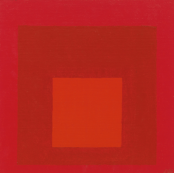
Albers' Homage to the Square
The works of this movement were rooted in geometry while focusing on the psychological effects of colour composition and, in particular, the separation of colours. Further on in the century, Vanderpoel’s theoretical proofs bear an uncanny similarity to the work of Josef Albers (1888–1976). His iconic Homage to the Square from 1964 takes influence from her exploration of advancing and retiring colours, in which she layers coloured squares in a fundamentally modern composition.
Besides its effect on wider creative practice, Vanderpoel’s Color Problems remains an essential text in the study of colour theory, outlining new methods of colour science throughout its pages. Pioneering in its execution, its accessible language encouraged a new readership to educate themselves on a practice previously guarded by scientists and artists. By shedding complicated language and breaking down scientific theories, Vanderpoel crafts an expert narrative on the historical concepts of colour theory to produce a volume that’s informative, aesthetically pleasing, and easy to understand. Her beautiful expressions of colour showcase a unique exploration of the subject where she achieves emotionally evocative works of aesthetic harmony, which would prove foundational to the worlds of art and science in the centuries that followed.
Emily Noyes Vanderpoel's Color Problems
‘In her “Colour Problems,”… [Vanderpoel] has aimed to combine the essential results of the scientific and artistic study of colour in concise, practical form, and to classify the study of colour in individual eyes, in light, in history, and in nature.’—Brush and Pencil, 1902-08
‘Merely to gaze at the plates one after another is an education of the taste.’—The School Arts Book, 1908
‘A great deal will be found in these pages that will be of practical service, particularly to those who have not been able to read the works of Chevreuil, Von Bezold, Rood, Church, and others.’—Bernard Quatritch, 1909
Discover the Art Meets Science Collection
-
 Art/Chemistry/Illustration/Japanese Woodblock/Pyrotechnics/ScienceSelect options This product has multiple variants. The options may be chosen on the product page
Jinta Hirayama’s Japanese Firework Illustrations
£6.99 – £24.99Price range: £6.99 through £24.99 -
 Nature/Botany/Illustration/Mushrooms/MycologySelect options This product has multiple variants. The options may be chosen on the product page
Anna Maria Hussey’s Mushroom Illustrations
£7.99 – £29.99Price range: £7.99 through £29.99 -
 Art/Color TheorySelect options This product has multiple variants. The options may be chosen on the product page
Munsell’s Colour System
£7.99 – £25.99Price range: £7.99 through £25.99 -
 Art/Astronomy/ScienceSelect options This product has multiple variants. The options may be chosen on the product page
Urania’s Star Charts
£7.99 – £29.99Price range: £7.99 through £29.99 -
 Art/Color TheorySelect options This product has multiple variants. The options may be chosen on the product page
Emily Vanderpoel’s Color Problems
£7.99 – £34.99Price range: £7.99 through £34.99 -
 Animals/Butterflies & Moths/NatureSelect options This product has multiple variants. The options may be chosen on the product page
Maria Sibylla Merian’s Metamorphosis
£9.99 – £34.99Price range: £9.99 through £34.99 -
 Human Anatomy & Physiology/Life Sciences/ScienceSelect options This product has multiple variants. The options may be chosen on the product page
Henry Gray’s Anatomy
£9.99 – £39.99Price range: £9.99 through £39.99 -
 Artists' Books/Individual Photographers/PhotographySelect options This product has multiple variants. The options may be chosen on the product page
Anna Atkins’ Cyanotypes of British and Foreign Ferns
£9.99 – £24.99Price range: £9.99 through £24.99 -
 Life Sciences/Marine Biology/ScienceSelect options This product has multiple variants. The options may be chosen on the product page
Ernst Haeckel’s Art Forms in Nature
£9.99 – £28.99Price range: £9.99 through £28.99 -
 Geometry/MathematicsSelect options This product has multiple variants. The options may be chosen on the product page
Oliver Byrne’s Elements of Euclid
£9.99 – £33.99Price range: £9.99 through £33.99 -
 Art/Color TheorySelect options This product has multiple variants. The options may be chosen on the product page
Werner’s Nomenclature of Colours
£9.99 – £22.99Price range: £9.99 through £22.99


